Input Specific Keyboards for Mobile Devices

Responsive design has revolutionised how we consume web content on mobile devices, making reading and interacting immeasurably easier on smaller screens.
Mobile devices with digital touch-screen keyboards have a major advantage; being able to adapt to the content a user is interacting with. Using the correct input field types is all that is required to hint to the mobile browser which type of keyboard should be shown to make it easier for the user to input the data your form is requesting.
<form>
    <input name="company" type="text">
    <input name="email" type="text">
    <input name="telephone" type="text">
    <textarea name="question" rows=5></textarea>
</form>If the contents of your form looked similar to the above, the mobile browser would just display the default keyboard as you haven't given it any meaningful hints to the type of data you want the user to input. This will look like:
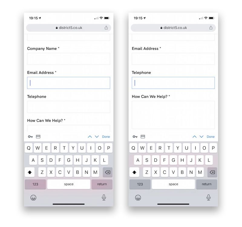
Notice the standard keyboard for both the email address and telephone fields. With a few small modifications we can make something much more user friendly:
<form>
    <input name="company" type="text">
    <input name="email" type="email">
    <input name="telephone" type="tel">
    <textarea name="question" rows=5></textarea>
</form>Here we can change the type of the email and telephone inputs to email and tel respectively. This hints to the browser that we want something resembling an email address, followed by a telephone number. See how this changes the keyboards on the mobile device:
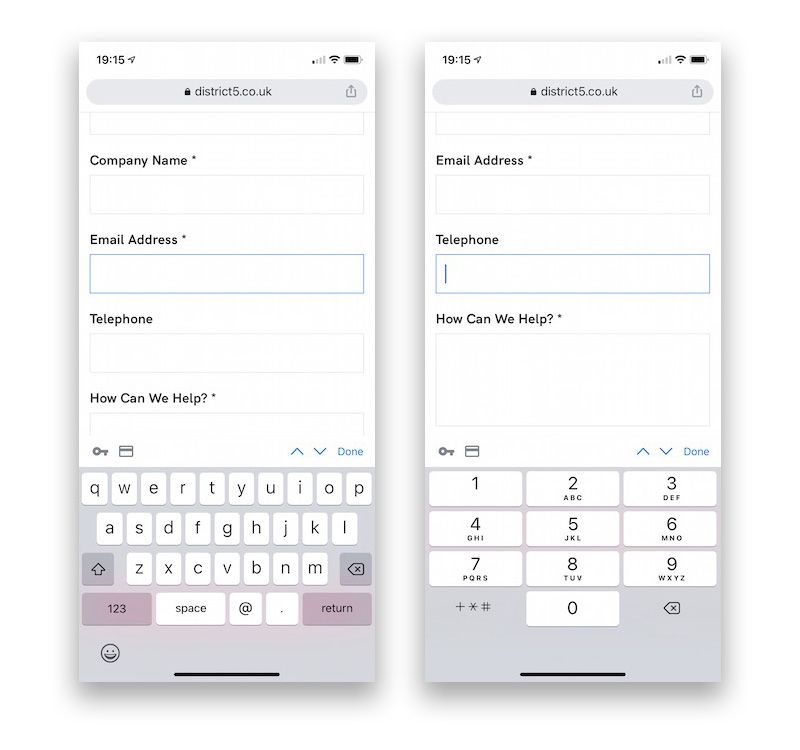
The keyboard for the email address is only subtly different on iOS, however the addition of the @ and period keys makes typing an email address quicker by not forcing the user to switch to the alternative '123' keyboard layout for numbers and symbols.
The difference in layout for the telephone number is immediately obvious, and more resembles the interface you see when using the phone app on your mobile device. This again means the user doesn't need to switch to an alternate keyboard to find numbers.
And there you have it! A simple tweak to make your responsive site even easier for users consuming your content on mobile devices.